
A few years ago, websites were built mainly for desktop screens. But today, over 70% of global internet users browse on their phones. That’s why Google switched to mobile first indexing; it ranks your website based on how it performs on mobile, not desktop. So if your site doesn’t work well on mobile, it won’t just lose visitors; it will lose rankings too. This is exactly why mobile-first matters for SEO in 2025, as Google continues to prioritize mobile-friendly sites that deliver a fast and responsive experience. Understanding why mobile first matters for SEO in 2025 can help businesses adapt and thrive. Knowing why mobile first matters for SEO in 2025 is essential for future growth.
In this guide, we will break down what mobile first means, why it matters for SEO in 2025, and how to make your site ready for it. Knowing why mobile first matters for SEO in 2025 is critical for staying competitive.
What Is Mobile First Design?
Mobile first means you design and build your website starting from mobile screens first, then scale it up for tablets and desktops.
It’s not just about shrinking a desktop site to fit a phone. It’s about thinking how your user behaves on a small screen simple navigation, readable text, fast loading and clear buttons.

Example:
If your homepage has a large image slider that slows down loading on mobile, a mobile-first approach would replace it with a lighter, faster banner or static hero image.
Our digital marketing agency often uses this method when optimizing client websites for speed and usability.
Google Mobile First Indexing Explained
Since March 2021, Google has been using mobile-first indexing by default for all websites. That means Google’s crawlers look at your mobile version to decide how your site ranks.nks.
If your mobile version has less content, missing structured data or broken navigation, Google assumes your desktop version is outdated.
So, in 2025, a non mobile-friendly site is an SEO problem — not just a design issue.
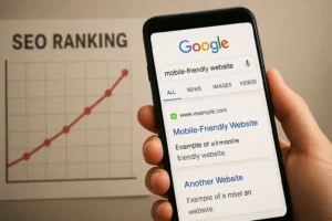
Why Mobile First Matters for SEO in 2025
To reinforce why mobile first matters for SEO in 2025, we must consider user behavior trends.
Let’s break down the key reasons.
1. Google Ranks Mobile Friendly Sites Higher
This one is simple Google wants users to have a good experience.
If your site is hard to use on mobile it automatically loses ranking opportunities.
A mobile friendly website:
- Loads fast
- Fits small screens
- Has readable text
- Uses clickable buttons and menus
These factors directly affect SEO performance. You can test your website’s mobile performance using Google’s free Mobile Friendly Test.
At DevPulse360, a trusted digital marketing agency, we ensure every project passes Google’s mobile usability standards before launch.
2. Mobile Experience Affects Bounce Rate
Bounce rate means how quickly users leave your site after opening it.
If your website loads slowly or looks broken on mobile people will exit and Google notices.
Example:
If someone clicks your site from Google search but immediately goes back because the menu did not work it signals Google that your site isn’t helpful.
High bounce rate = lower ranking over time.
A mobile first site keeps users engaged longer reducing bounce rate.
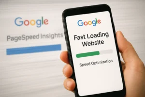
3. Page Speed Is a Ranking Factor
Since Google’s Core Web Vitals update speed and performance are major ranking signals.
Your site must:
- Load in under 3 seconds
- Have stable layout shifts
- Respond fast to interactions
Large images, heavy scripts or unused plugins slow down performance especially on mobile.
Tools like PageSpeed Insights and GTmetrix can help analyze and improve performance.
At DevPulse360, we build optimized WordPress and Shopify sites that pass Core Web Vitals easily.
4. Mobile Users Convert More
Most online shopping and service bookings now happen on phones.
If your forms, buttons or checkout are not optimized for mobile you lose sales.
Understanding why mobile first matters for SEO in 2025 helps businesses optimize their user interfaces.
Example:
A digital marketing agency website should have a simple “Get a Free Quote” button that is visible on every screen size not hidden in a desktop only sidebar.
Google’s studies show that mobile friendly design can improve conversions by up to 67%.

5. Voice Search Relies on Mobile Optimization
People often use voice search on mobile devices asking questions like:
“What’s the best web design company in Dubai?”
“How do I improve SEO in 2025?”
For your site to appear in these results:
- Use natural language and long tail keywords
- Structure content with clear headings
- Optimize mobile performance (since most voice searches happen on phones)
Analyzing why mobile first matters for SEO in 2025 can lead to better site architecture.
Mobile first and voice SEO go hand in hand.
This is a strategy every forward-thinking digital marketing agency is already applying.

6. Better User Experience = Better SEO
Google now measures UX (User Experience) using Core Web Vitals.
Mobile first improves UX by focusing on:
- Readable fonts
- Touch friendly buttons
- Simple navigation
- Fast-loading content
If visitors enjoy browsing your site they will stay longer, explore more pages and share your content all positive SEO signals.

This approach highlights why mobile first matters for SEO in 2025 and beyond.
7. Accessibility and Mobile First Go Together
Accessibility means making your site usable for everyone including users with disabilities.
Mobile first naturally supports accessibility because it uses:
- Large buttons
- High contrast text
- Simple layouts
In 2025, accessibility is not optional. It is part of Google’s E-A-T (Expertise, Authoritativeness, Trustworthiness) guidelines that affect rankings.
How to Make Your Website Mobile First?
Here’s what you can do today.
1. Start with a Responsive Framework
Use responsive frameworks like Elementor, Bootstrap or Tailwind CSS. They adjust layouts automatically for any screen.
If you use WordPress make sure your theme is fully responsive.
You can test it on mobile and tablet simulators.
Check our Web Design & Development Services for responsive site creation.
2. Optimize Images and Media
Use next gen image formats like WebP and enable lazy loading (images load only when visible).
Compress videos and host them on platforms like YouTube or Vimeo instead of directly embedding large files.
3. Simplify Navigation
Avoid complex menus.
Use a hamburger menu or sticky header with key links Home, Services, Contact, Blog.
If users can’t find what they need in three clicks, you’ll lose them.
Visit our Ecommerce Development page to see an example of streamlined navigation.
4. Use Readable Fonts and Proper Spacing
Choose clean, readable fonts like Inter, Roboto or Poppins.
Keep body text at least 16px and maintain good line spacing.
Avoid fancy or overly thin fonts that look good on desktop but unreadable on phones.
5. Prioritize Content Over Design
On small screens, people scroll fast.
Use clear headings, short paragraphs and simple visuals.
Always place key information (offers, CTAs, contact buttons) near the top of the screen.
6. Test Across Real Devices
Don’t rely only on emulators. Test your website on actual phones and tablets Android and iPhone.
When developing your strategy, remember why mobile first matters for SEO in 2025.
Check forms, buttons, sliders and page speed.
At DevPulse360, we test every website on multiple devices before launch.
Real World Example: Mobile First in Action
A client from Dubai came to us with an old WordPress site that looked fine on desktop but was unreadable on phones.
We rebuilt it using a mobile first layout, reduced image sizes and optimized the code.
Result:
- Page load time improved from 6.5s to 1.9s
- Bounce rate dropped by 40%
- Mobile leads increased by 62%
That is the power of mobile first SEO done right.

Final Thoughts
Ultimately, understanding why mobile first matters for SEO in 2025 can help you stay ahead of competitors.
Mobile first is not just a web design trend anymore it is the foundation of SEO in 2025.
Emphasizing why mobile first matters for SEO in 2025 is not just a trend, but a necessity.
If your website is not built for mobile you are already behind your competitors.
Start with responsive layouts, optimize your images, simplify content and test performance regularly. The goal is not just to look good on phones it is to deliver a fast, friendly experience that ranks higher and converts better.
Want help making your website mobile-first and SEO ready?
Contact DevPulse360, we build websites that perform beautifully on every device.